
Is the recent pattern of employment growth beneficial for Spain’s productivity?
The Spanish labour market has changed its growth pattern since the pandemic, showing an increase in employment in sectors such as health, education and technology. Is this new model favouring an increase in productivity? We analyse the impact of the composition effect and how it compares with other expansive cycles.

Recent changes in the pattern of employment growth
The Spanish economy has experienced strong employment growth since emerging from the pandemic. In seasonally adjusted terms, in April 2025 the number of Social Security affiliates stood 12.8% above the level of December 2019, which is equivalent to an average annual growth of 2.3%.
In the first chart, we show the contribution of each sector to the growth of Social Security affiliates in two periods: between 2013 and 2019, on the vertical axis, and between 2019 and April 2025, on the horizontal axis. The contributions are expressed as a percentage of the total cumulative growth.

As can be seen, since the pandemic Spain has been creating relatively more jobs in public services (education and health), as well as in the tech and professional services sectors. This contrasts with the previous cycle, when trade, manufacturing and other traditional business services (administrative activities) played a greater role.
This change in the structure of employment growth raises a key question: is this new pattern more favourable for an increase in productivity? According to our analyses, the answer is affirmative, albeit with nuances.
Measuring productivity and composition effect
We measure labour productivity as the real gross value added (GVA) that is generated per hour worked, also known as apparent labour productivity.1 This metric presents some problems. For instance, capital-intensive sectors will tend to appear to be more productive than employment-intensive ones. However, it has the advantage that it can be calculated directly from national accounting data, so it does not have to be estimated.2
We have compared the evolution of apparent productivity in three periods:
- Expansion Q1 2000-Q4 2007: productivity per hour increased by just 0.7% in total, representing a mere 0.1% average annual growth.
- Recovery Q4 2013-Q4 2019: productivity grew by 3.8% in total, equivalent to an annual average of around 0.6%.
- Recent period Q4 2019-Q1 2025: productivity amassed an increase of 2.5%, equivalent to 0.5% annually.
At first glance, the rate of productivity growth in the current cycle is similar to that of the period 2013-2019. However, in order to better understand the relationship between employment and productivity, we need to look at where that productivity growth comes from. To this end, we have broken down its increase into two components.
- Intensive margin: increased productivity within each sector, while maintaining the sectoral structure of employment. This reflects improvements in efficiency, technology or human capital in the companies within each sector.
- Composition effect: increased productivity due to changes in the distribution of total employment across the various sectors, maintaining the productivity of each sector constant. This reflects the impact of workers relocating between more or less productive sectors.
In this article we focus on the composition effect. The second chart shows the magnitude of this effect in the various periods in question. The chart reveals several important points. Firstly, the composition effect has been negative in all three periods analysed. In all the recent expansionary cycles, the change in the structure of employment has subtracted some growth from productivity.
- 1
For a more precise analysis, we have excluded the real estate sector from the calculations, as its GVA is distorted by attributed rents, i.e. the theoretical rental value assigned to owner-occupied dwellings. Since this is a small sector (around 1% of all hours worked) and we only have data corrected for this effect up until 2022, its exclusion allows us to focus on the underlying trend in productivity while also not missing out on recent information.
- 2
This contrasts with what is perhaps the most accurate measure of productivity, so-called total factor productivity (TFP). This measure is the part of GDP growth that is not explained by the accumulation of factors of production, be it labour, capital, human capital or others. However, TFP has to be estimated, and there is a lot of uncertainty surrounding these estimates.
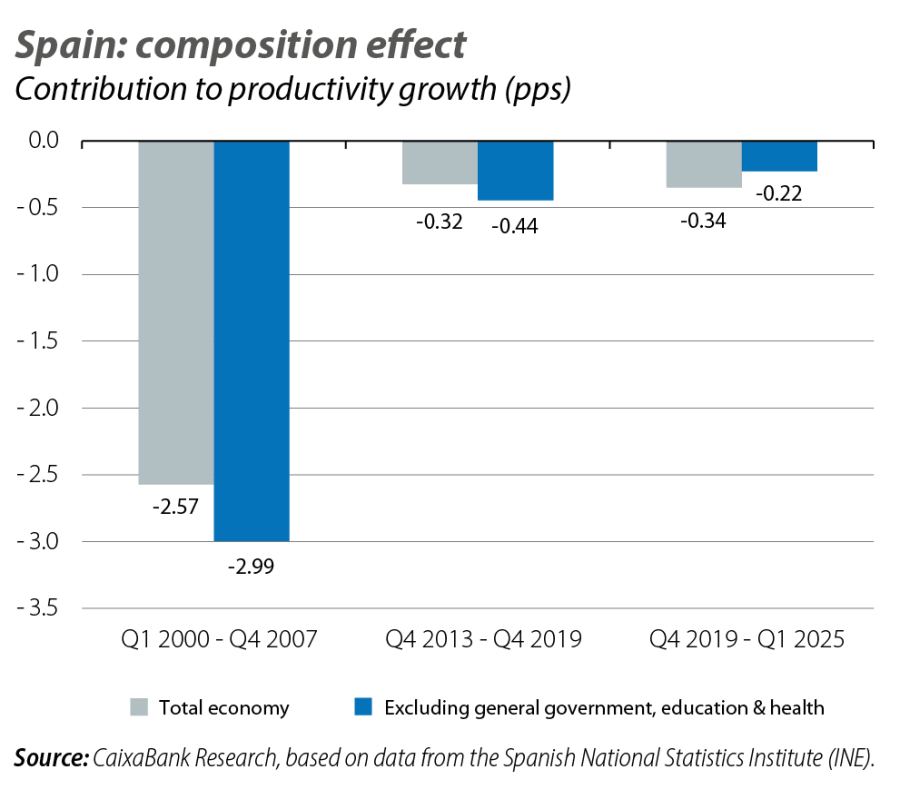
Secondly, the penalty due to the change of composition was particularly pronounced between 2000 and 2007. In contrast, in the two subsequent cycles (2013-2019 and 2019-2025), the negative composition effect has been much smaller, and practically equal in magnitude in both cases. This implies that the recent pattern of job creation has been «similar» to that of the previous cycle, in that the slowdown in productivity growth caused by sectoral changes has been very limited in comparison with periods further in the past.
Given the importance of the education and health sectors in the current cycle, and bearing in mind that these sectors are dominated by the public sector and therefore do not generally operate at market prices, it is also interesting to replicate the analysis focusing on market sectors. If we exclude from the analysis the predominantly public branches of the economy, the result changes slightly. The composition effect in the period 2013-2019 worsens by 0.1 pp, while in 2019-2025 it improves by 0.1 pp. Thus, the negative contribution of the composition effect in the recent period becomes half that noted for the period 2013-2019.
Which sectors are driving up productivity or slowing it down?
Understanding the «why» behind a slightly negative composition effect in the recent phase requires us to identify which sectors have seen their proportion of total employment increase or decrease and what their level of productivity is. To this end, we use a third bubble chart which plots, for each sector, its labour productivity on the vertical axis and, on the horizontal axis, the change in its share of total employment between Q4 2019 and Q1 2025. In this chart, the size of the bubble measures the absolute contribution of each sector to the composition effect, which is the result of multiplying the change in its share of the total by the productivity of that sector. A large bubble thus indicates that the sector has greatly influenced the composition effect, due to a combination of a change in its relative size and and its productivity level. The horizontal red dashed line marks the national average productivity to facilitate comparisons.
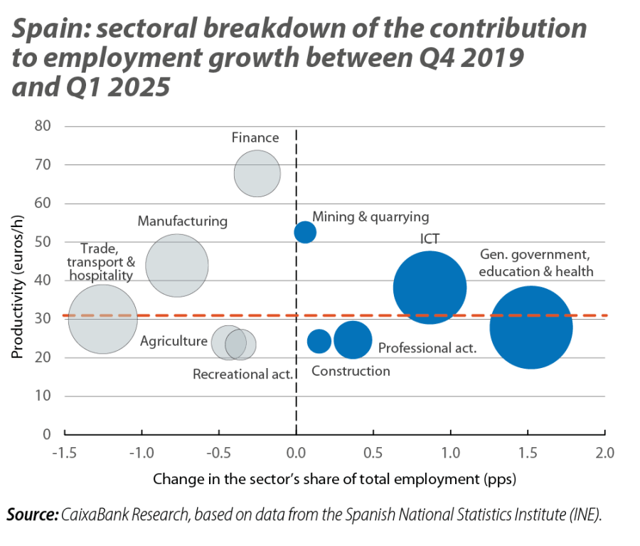
Three sectors stand out in the recent phase due to the increase in their share of total employment. The general government, education and health sector has registered a sharp increase in the proportion of total employment it represents, but its productivity is approximately in line with the national average. The ICT sector has experienced a marked increase in its share of employment and is characterised by productivity above the national average. This sector thus provides a significant positive composition effect, as employment is growing in a sector in which every hour worked contributes a great deal of value added. Finally, the professional, scientific and technical activities sector, although to a lesser extent than the aforementioned ones, also saw its share of total employment increase. However, and perhaps counter intuitively, this sector has a low apparent labour productivity, possibly because it is not a capital-intensive sector, so its contribution to the composition effect is limited.3
Among the sectors that have seen their share of total employment decrease in this period, three also stand out. Trade, transportation and hospitality, which saw its share of total employment drop sharply in the wake of the pandemic but has a productivity level similar to the national average. The manufacturing industry has also seen its share of employment decline. Given that manufacturing has above-average productivity, this decline results in a particularly negative contribution to aggregate productivity. Finally, the financial sector, which has a high apparent productivity, has also seen its share of total employment shrink.
- 3
With data from 2022, the professional, scientific and technical activities sector has a net capital stock per hour worked of 45.7 euros, compared to the national average of 155 euros, making it the third lowest sector in the ranking (according to the National Classification of Economic Activities [CNAE] at the 1-digit level of detail).
Conclusions
The evidence shows that the sectoral pattern of job creation since 2019 has been slightly more benign for productivity than that of the 2013-2019 cycle, and far higher than the expansion of the 2000s. This does not mean that productivity is growing rapidly – its gains remain modest, at around 0.5% per year on average – but rather that the distribution of new jobs is at least not weighing down average productivity, as has been the case in the past.
If we focus on the most recent period, the most dynamic sectors in terms of job creation belong to both the public sphere (education and health) and that of private technology (ICT) and specialist services (professional activities), and their combined evolution has managed to largely offset – albeit not entirely – the adverse effect of the loss of employment in traditionally productive sectors such as industry and finance.